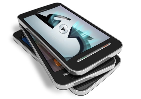
Mobile Compatible Websites
The number of people using mobile phones throughout the world is more than 2.4 billion, and out of that nearly 30% use their phones to surf the internet on a regular basis. With the increasing prevalence of handheld devices coming equipped with XHTML browsers, it is becoming more important to design mobile phone compatible websites.
Synk Media can provide a service which ensures our customers have both a mobile responsive website and a mobile compatible website.
Making your website “mobile phone and PDA compatible” is worth serious consideration. A mobile website involves special design and development techniques; if a website is set up correctly, the same pages will be compatible with both conventional desktop/laptop browsers and mobile phone browsers.
Websites that can be viewed on a mobile phone are completely different from those that we see on the internet; they are built in a different programming language and have to be developed such that they can easily be viewed on the smaller screens such as mobile phones.
What Synk Media take into consideration?
- Ensuring that the page sizes are smaller and therefore optimised for smaller screens.
- Mobile phones are available in different sizes with various sizes of screens, we ensure that site designs are such that they works on most of the screen sizes.
- Ensure websites adheres to the W3C standards